This post will focus solely on technical analysis of currencies and indices.
EUR/USD (Bearish)
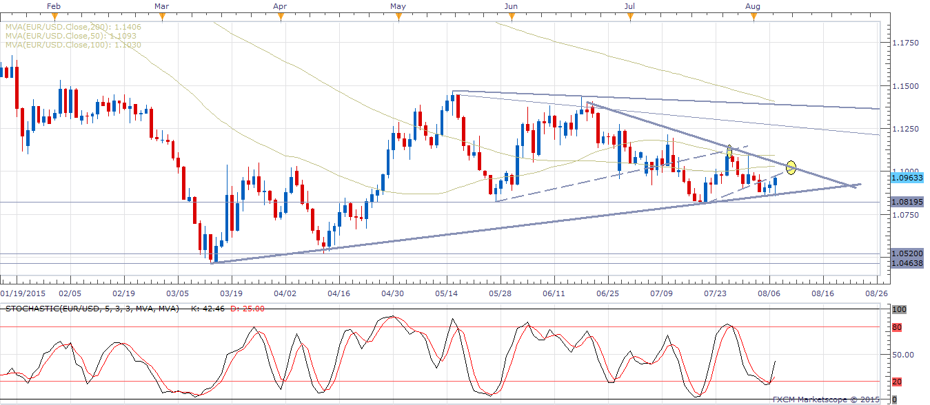
As you can see on the “Daily” chart, Symmetrical Triangle or contracting wedge (both very similar) has been formed. The trading range is contracting, not far away from breakout. You see the small yellow circle (around 1.1020) that EUR/USD is approaching? That’s where I would short EUR/USD. That’s the place where there are trend resistances, and Simple Moving Average (SMA) of 50 and 100 are approaching. Not only that, but Stochastic indicator should get close to 80 (overbought), as EUR/USD goes to that yellow circle. Let’s take a look at 4H (4-Hour) chart.
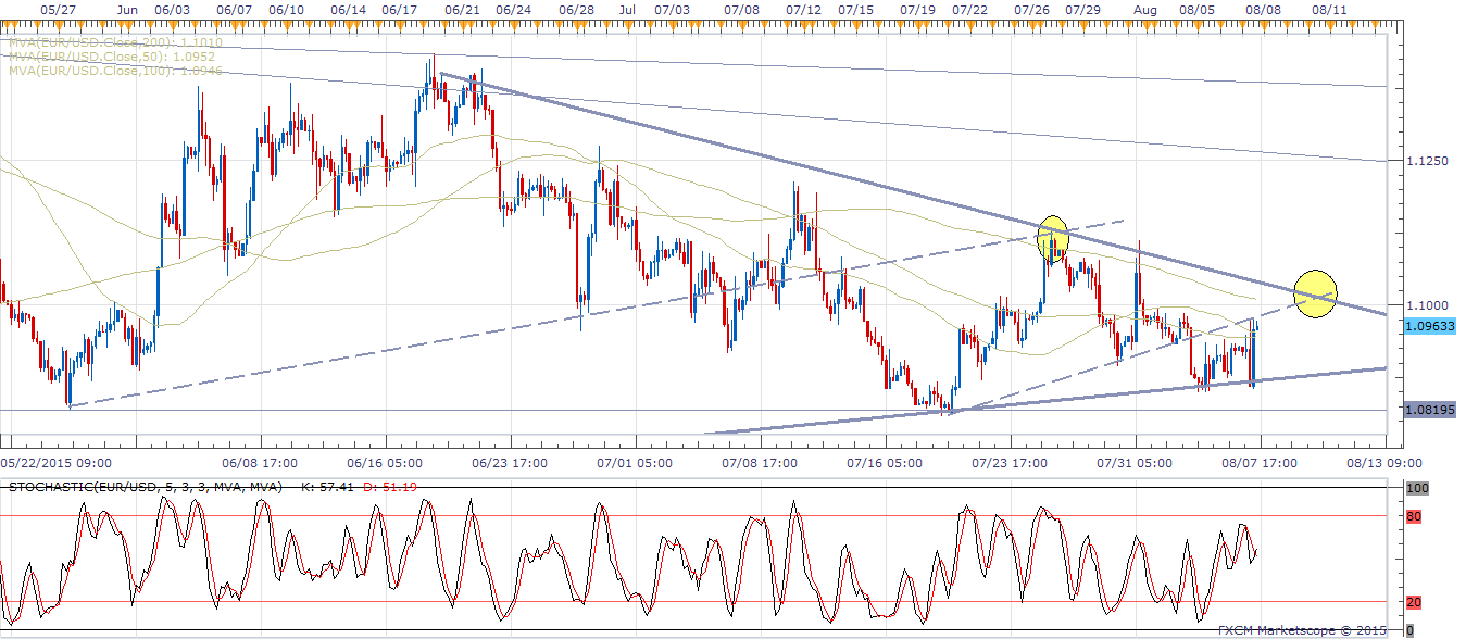
The first yellow circle you see on the “4H” chart was a sell single because support-turned-resistance at a rising trend line. Same thing is happening right now to EUR/USD, as it approaches the second yellow circle (around 1.1020).
The reason I’m shorting it in the tightening consolidation before the breakout is because there are many technical reasons to short it. Even if it goes opposite direction, my loss will be very limited (Just above the trend – around 1.1030)
Let’s take a look at 1H (1-Hour) chart.
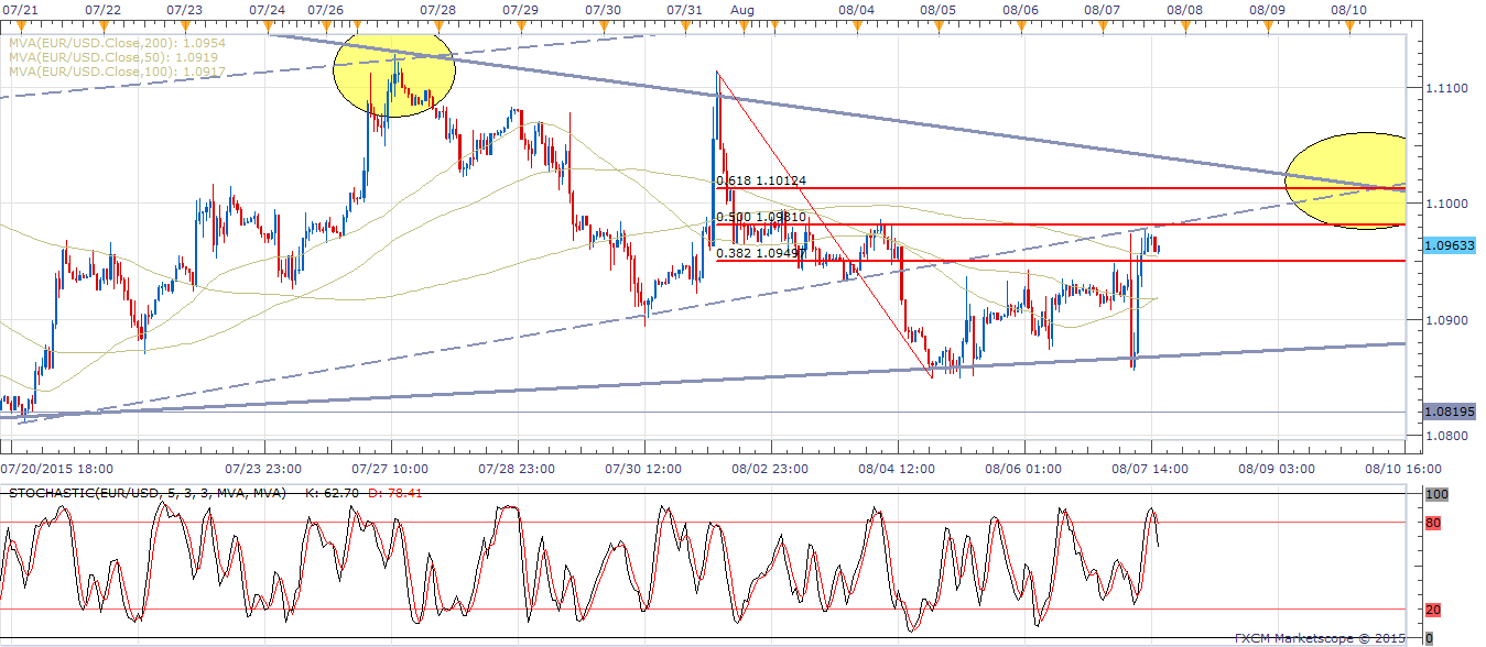
On 1H chart, I added Fibonacci Retracements indicator. Fibonacci Retracements basically act as support and resistance lines. The red lines you see on “1H” chart, are resistance lines. 61.8% level (or 0.618%) at 1.1012 is known as “golden ratio”. In my past expensive, 61.8% level has worked well. Plus, 61.8% level connects with the two trend lines in the yellow circle.
I would short EUR/USD as it approaches the middle of the second yellow circle (around 1.1015). Stop loss: 1.1030 (just above the trends lines and golden ratio (0.618%) level. Target: 1.0890 (just above the support trend as seen in the charts above). My target level (1.890) will change as time goes on, to stay in-line with the support trend.
S&P 500 (Bullish)
Let’s take at look “Weekly” chart, going back as far as 2008.
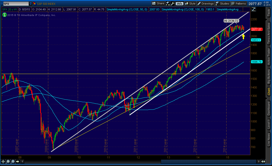
As you can in the “Weekly” chart, ever since hitting bottom in early 2009, S&P 500 have been in a uptrend. If you look at the white-line, there’s a long channel (you can call it a trend if you want). Current price is just above the 50 SMA (Simple Moving Average). Plus, it’s much closer to the support line of the channel.
Let’s take a look at two “Daily” charts.
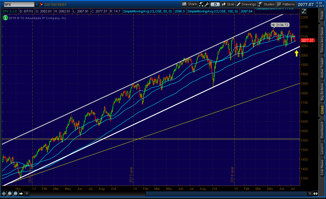
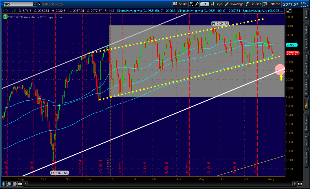
If you look at any of the two “Daily” charts, you can see that the current price is sitting on 200 SMA and on recent-uptrend support (yellow dotted line). Even though it’s a strong signal to go long, I would not. The reason is that it is a 3rd time in over a month that the price is sitting on 200 SMA and uptrend support (yellow dotted line) , and the recent highs in the uptrend range were unable to reach the trend resistance as well break the previous high. It shows that the bulls are losing control and bears are slowly gaining momentum.
Where I would go long is at the circle shown with yellow arrow (around 2042). It’s just above the strong channel (or a trend) support line (Bold-white line) as shown in all three S&P 500 charts above. My stop loss would be just below the bold-white line. My target would be at the resistance level of 2134.
If you have any questions, feel free to leave your questions in the comments section, and/or contact me. Thank you.

